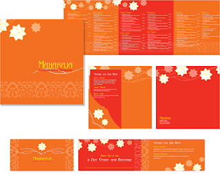
 The word "boring" comes to mind when I see this menu. There are words everywhere, and they are crammed as tight as possible on the pages. If they invested in at least one other color, it might break up the monotonous amount of words a bit.
 This design is more interesting with the background and look of torn paper. I would like to know the atmosphere of the restaurant because at first I thought of a place like Joe's Crab Shack, however they serve breakfast and the prices aren't high.
  This menu is visually nice to look at, however, I don't know how easy it would be to actually order from. The colors and shapes are super fun, though, and I would want to eat here just by looking at this menu.
A place called Rico's probably needs all the help it can get (just kidding). At first I didn't like this at all, but then I looked at how everything was grouped. It actually very simple to order, but no descriptions are provided. It's alright, but maybe they could split it up on two pages to give more information about the food.

No comments:
Post a Comment