Friday, April 30, 2010

5/5/10 - 5 Great Newspaper Designs

Most of the Mexican newspapers I saw were extremely colorful. It is definitely eye-catching. Many papers like this one were heavy on the info above-the-fold (e.g. the baby on this, probably eating lead paint, has nothing to do with the main headline). I like that each story has a picture and a lead in to make you open the paper.

The previous paper, this one is very heavy at the top. I think that if they would've brought some more of that imagery down, it would be better. The bottom half is very text heavy, but the top pieced-pictures are brilliant.

I really like the colored boxes and text for the different stories. As a reader, it makes it easy to move from one story to the next. Each image is striking, and it appears that the designer took time to pick the best pic for each slot.

Why do I like this seemingly typical paper? It is because I like the traditional newspaper look. However, the large graphics keep me interested, and I'm going to bet that I would read every cutline under the pics. It's clean and simple, like a news story should read.

I love the colors! I'm assuming, since I can't read it, that each color pairs with a certain section. I would love to see if the headers match those sections on the inside, as well. The colored boxes help to separate stories and images.

Friday, April 16, 2010

4/21/10 - 5 Ads of the World Finds

There is a whole series of Volkswagen independent cinema ads like this using different movies on the police reports/tickets/Car performance tests. This one happens to be Toy Story, and it made me laugh ("NOT MY FAULT"). It's rather simple with the piece of paper sitting on a plain background, but it gets the job done.

This reminded me of our two city airline designs. There was one for Paris with the "A" enlarged to be the Eiffel Tower, but I like the creativity of the double-decker bus in this ad.

(Sorry it is so small and blurry, I tried to enlarge it) I think Max Huber when I see this design, especially the golf ad he designed. If the image wasn't so blurry, you could see the great geometric shapes in the background with the bold colors in the foreground. The negative space works well to put the focus on the center of the page, then down to the left hand side text.

It's cute and uses negative space well. The point is that you can customize your vehicle, and flashy imagery wasn't needed to tell the viewer that.

Again, this is a series with the bull somehow conveying that he is beating the bear (propping his feet upon a bearskin rug is another I liked). It is childish to use the stuffed animals and pencil as a bat, but if you read the tag line it makes sense (they are examining the shift in the changing market). I like that they try to make it simpler than what it is, and it shows that they will explain the situation without a lot of over the top language.

Wednesday, April 14, 2010

4/14/10 - 5 Ad Finds

The humor in this advertisement is why I think it works. It works perfectly to move your eye down the line of typical hunters to the last guy holding a vacuum. Another reason I like it is because it could easily be a typical picture found in the Saturday Evening Post with the classic feel.

Most of the ads I found have humor to them, and I think humor works great when it is actually funny and not stupid or too subtle. In this ad, you would expect to pick up these binoculars and immediately have any scenery right in front of you.

It literally took me a few seconds of looking at this ad to understand it because I didn't see the slogan "Become the King of Bluff." I was slightly confused at first, but then it became hilarious. There were other ads in this campaign with a male beauty queen (dress, tiara and sash included) and a grandma being arrested with a man holding a crowbar standing on her porch. The irony works.

I love the mixture of high fashion and everyday products mixed together here. The models make the products high fashion, and the products make the models slightly more down to earth. Even though a lot is going on in the spread, I'm not overwhelmed, but rather I'm intrigued.

I think of "designing with the delete key" when I see this. If you can't read the fine print, it is an ad by Guinness beer stating that your reaction time is delayed with every drink. The sign is recognizable, and therefore a lot of explanation is unnecessary.

Monday, April 5, 2010

5 Finds - Helvetica

Helvetica is a modern font, and this packaging is definitely modern with the white background. You know exactly what brand you are looking at, and it helps that the black font matches all the utensils handles to make it even more streamline.

I don't know how many times I have looked at this logo without even realizing that there is a sun in the center of it. It is a creative use of the font that sets it apart from other Helvetica users.

Perhaps it is because I went to the ginormous Crate&Barrel store in Chicago last week that I included this logo. However, the items sold there are modern and sleek, so Helvetica matches quite nicely.
How the designers made this symbol so sharp and sophisticated, I may never know. Three letters on a circle and four triangles has never looked better (or has been so expensive).
I'm rather fond of turning font into pictures, and this pic uses Helvetica to make this man! Different shades of Helvetica were used to put a different spin on the font.

Saturday, March 20, 2010

5 Finds - Bad Typography

During the '08 election season I couldn't put my finger on why the GOP web site was so unappealing, yet the Dem site was so nice to look at. Now I know that the type had a lot to do with it. Where do you even begin on this site? It has a bazillion fonts, point sizes and colors.

Ok, I must admit that I found this on another blog site, and I probably wouldn't have noticed the terrible typography otherwise. The spacing in line two is wack, and then line three has the words crammed together. You would think that the FBI could do a little better, especially since this is shown before EVERY movie.

I found a web site called papyruswatch.com, and I will never look at the font the same way again. Here is one of the worst examples posted on the site. Not only are the graphics bad, but everything else is crammed and ugly.


I'm not sure if this is a magazine ad or newspaper insert or what, but I can count at least three different fonts that don't really compliment eachother. Zoe's is in this fun font, but everything else is in a serious font with only color to add spunk to it.


This reminds me of a "before" from Cardon Copy. Whoever designed this should have been fired, unless they were color blind or nearly blind.


Friday, March 12, 2010

5 Finds - Magazine Layouts

A lot of the spreads I saw used some sort of mirror effect on the two pages. One would have a picture of someone's head, and the other side was an oval shape that was similar in shape. This does it too with the lines forming a circular pattern like the plates. I like that they split the word "meal" up and then carroted in the word "family" in the actual article.
If the smudge wasn't down the center of the picture, I don't think I would have taken a second look at this spread. The messiness of it, combined with the large amount of white space draws me right into the words.

If this spread didn't include Richard Gere, I probably wouldn't have included it. However, the black, grey and white mixed with real photography and animation makes the viewer want to know what is going on here. I like the quirkiness of it.


I suppose I really like black and white pictures. Once again, there is so much white space that you have to read what is written on the business card, and you want to know why that suit-clad man is walking off the page.


I love that this is spread over two pages, and it is just one giant picture. If this doesn't make you want to read this article, then I don't think anything would. It is also very personal because everything is written by hand, not typed.


Monday, March 8, 2010

5 Finds Menus

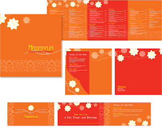
The word "boring" comes to mind when I see this menu. There are words everywhere, and they are crammed as tight as possible on the pages. If they invested in at least one other color, it might break up the monotonous amount of words a bit.


This design is more interesting with the background and look of torn paper. I would like to know the atmosphere of the restaurant because at first I thought of a place like Joe's Crab Shack, however they serve breakfast and the prices aren't high.

This menu is visually nice to look at, however, I don't know how easy it would be to actually order from. The colors and shapes are super fun, though, and I would want to eat here just by looking at this menu.


A place called Rico's probably needs all the help it can get (just kidding). At first I didn't like this at all, but then I looked at how everything was grouped. It actually very simple to order, but no descriptions are provided. It's alright, but maybe they could split it up on two pages to give more information about the food.


The colors on this menu are beautiful, and I love the white and yellow print they use. This is probably my favorite find this week because of the subtle details and also because of the bold graphics they use.


Friday, February 26, 2010

Book Cover Finds

If I were walking through a bookstore, I do believe I would stop to see what this book is about. Though the words are tilted and coming out of the book, you can still read it.

When looking at the book covers, I scanned them like I would if I were looking for something to read. Everytime I passed one with an upside picture, I stopped because it wasn't what my eyes expected. This cover also uses pleasant color combinations.

I tend to be drawn towards simplicity and beautiful photography. This cover has both, and it is not overcrowded with eroneous graphics.


This cover is too fun to pass by. Of course it is a Stephen King book, and I would expect no less from one of his book designs. The optical illusion lets on to what the book may be about.


Maybe it is because I love news print, but this cover goes against my "simplicity" loving when it comes to books. Not only would I stop to read the title, but I would probably read everything else on the cover.


Friday, February 19, 2010

Week 3- 5 Finds of Letters

Ok, I had to look at this for a minute before I realized what the "pencil" was spelling (JCD). I love this logo because I would trust these people to come up with something creative for me.

This "logo" isn't so much selling something as it just plain funny. By cropping out the letters to form the heart, your mind is tricked to what the message is.

I like this because it mixes artistry and common letters to make something really cool. Each individual letter is distinct when looking at them, but as a whole it makes a fairly accurate picture of a bison.
In honor of my fiance and his love of terrible music, I added this band's trademark. Because the nails, or spikes, are used to start and end the word, we already get a sense that the band is probably very heavy or harsh. It's actually pretty cool, even though I don't care for their music.

It's funny how our eyes can trick us into seeing two different objects. In this case, there is an "i" visible, but also a zipper. All the designer did was edit and add rectangles.

Friday, February 12, 2010

2 Color 5 Finds

This logo is clever, but has too much going on in it. It surprises me that this is an advertising agency. My eye goes all over the place, and it actually takes me a moment to read the text.
I really like this simple design because you can reat it immediately, even with it missing the "e." Although it is someething even I could make, the logo gets the point across.
The main reason this logo caught my eye was that the "2" doubled as an "L." Plus, I really like the green and grey combo and the random backwards "e."
This design is funny, which is why I like it. However, I like the clever square that forms inside the pig.
I love this logo! I had to do a double take when I saw it because of the iconic image it plays on. Not only is it funny, but it definately catches your eye.